Color Palette Development
Building a powerful brand begins with crafting a color palette that visually communicates your brand’s personality and appeals to your target audience. At Chakraborty Works, our Color Palette Development for Logo & Brand Identity category is a thoughtful, strategic process that enhances your logo's impact and consistency across all brand touchpoints.
Our Color Palette Exploration Process Includes:
- Conduct brand research to understand core values and audience preferences.
- Analyze competitors to choose colors that differentiate your brand.
- Experiment with harmonious color combinations using color theory.
- Hold collaborative sessions to balance design with accessibility and practical use.
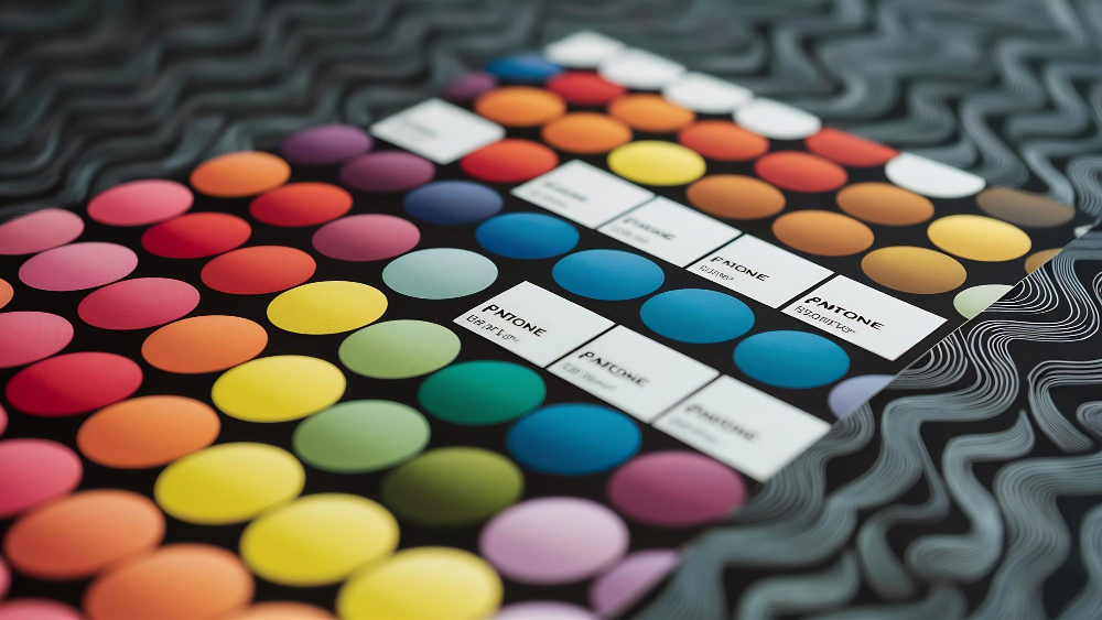
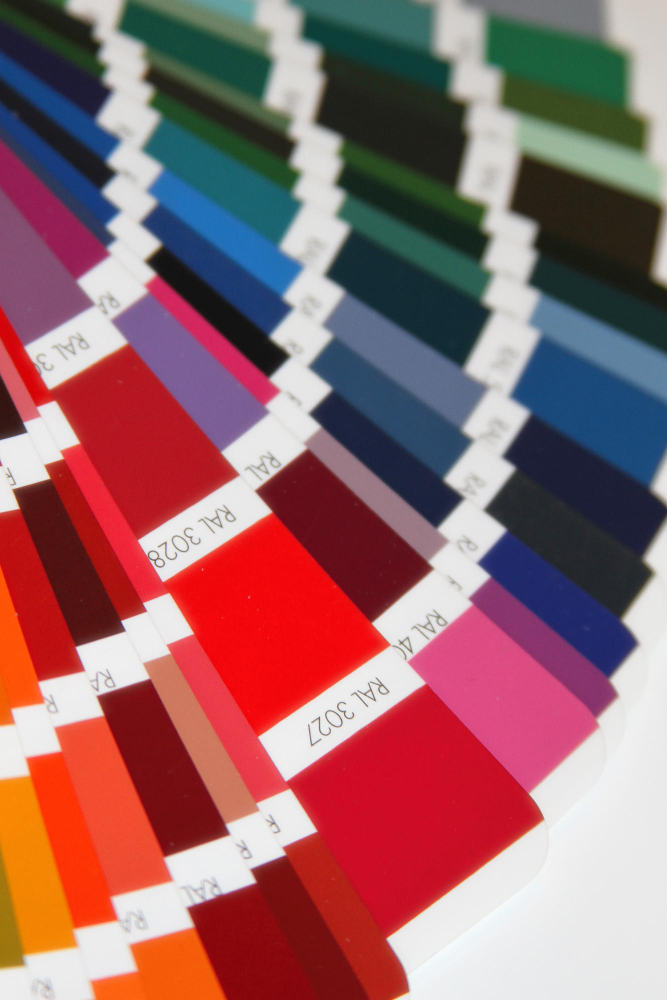
- Document primary, secondary, and accent colors for consistent application across media.
Process
01 Discovery & Research
We immerse in your brand’s ethos, analyzing both your audience and competitive market to identify color attributes that resonate and stand out. This user-focused research ensures your palette forms a meaningful emotional connection.
02 Wireframing & Prototyping
We translate research insights into preliminary color schemes applied to logo drafts and brand elements. Early prototypes allow for quick experimentation and iterative feedback, refining palette selections dynamically.
03 Design System
We develop a cohesive design system incorporating your finalized color palette alongside typography and graphics. This system guarantees your visual identity remains consistent, versatile, and scalable across all applications.
04 Design Validation
Before final rollout, we validate color choices through stakeholder review and user feedback, ensuring the palette evokes intended emotions and maintains accessibility standards, making your brand inclusive and memorable.
Importance
Why Color Palette Development Matters
Colors are powerful brand ambassadors—they influence perception and emotion subconsciously. A carefully developed palette ensures your logo communicates your message clearly and consistently, builds recognition, and differentiates you in crowded markets. By integrating creative research and human-centered design, Chakraborty Works crafts color stories that strengthen your brand identity and elevate your market presence.
FAQ
Learn some common answers about newly projects
1. What is color palette development in logo design?
It’s the initial phase where various ideas and sketches are generated and researched before finalizing a logo design.
2. 2. How do you choose the right colors for my brand?
We research your brand values, target audience, and industry trends, applying color psychology and theory to select shades that resonate emotionally and stand out competitively.
3. How many colors should a logo color palette have?
Typically, 2-3 main colors plus accent shades provide a balanced and versatile palette for logos.
4. Why is color consistency so important?
Consistent use of brand colors builds recognition, trust, and ensures your visuals look professional across all digital and print media.
5. Can I change my brand colors later?
While possible, changing colors frequently can confuse your audience; it’s best to pick a thoughtful palette early on.
6. Do you consider accessibility in color choices?
Yes, we test colors for contrast and readability to make sure your brand is inclusive and compliant with accessibility standards. Absolutely, the research and brainstorming ensure your logo is unique and stands out against competitors.
7. How do colors affect brand perception?
Colors evoke emotions and influence how customers perceive and connect with your brand, making the right palette critical for effective communication.